Smart Blindsin Glass
Colours

A practical guide to choosing slat and fabric colours for privacy, glare and interior style.

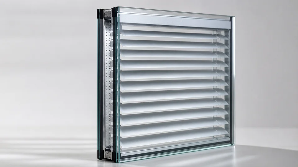
Sample venetian slats sealed inside an integral blind glass unit
Use this guide before a survey-led quote

Turn the guide into a better first enquiry

Useful before survey
Use it to narrow colour direction by room need, outside appearance and supplier-published light and solar figures.
Have ready
Frame colour, room photos, interior finishes and whether privacy, glare or stronger darkening matters most.
Survey confirms
Available samples, blind family, slat or fabric route and how the selected finish looks against the real frame and room light.
Request a survey-led quote

What this guide covers

Supplier-confirmed Venetian slat, vanity pleated and blackout fabric performance figures

Neutral, darker and exclusive colour options for different rooms

Colour considerations for commercial, healthcare and care environments

Start with the room, not the colour chart

Light neutrals such as white, cream and metallic silver are usually safest when you want blinds to disappear into the glazing. Morley Venetian data shows these colours have higher light reflection than darker slats.

Darker slats such as slate grey, anthracite and black create a stronger architectural finish and higher solar absorption figures. That can be helpful for glare control but is more visible from inside and outside.

Venetian versus pleated appearance

Venetian integral blinds create a sharper, more technical look with adjustable slats for fine privacy control. Morley publishes named Venetian slat colours and performance figures.

Vanity pleated fabrics create a softer look and fold compactly. Morley publishes fabric codes and performance figures, but not public colour names for every vanity code. Blackout pleated options are listed separately for bedrooms, media spaces and care settings.

Commercial colour choices

Commercial projects usually benefit from calm, repeatable finishes that match the wider glazing package. Neutral colours help keep healthcare, education and office spaces professional and easy to specify.

If multiple rooms are involved, choosing a consistent colour can simplify future replacement units and keeps elevations looking coherent from outside.

Need help with colour options guide?

Tell us about the windows or doors, existing frames and main priority. We will use those details to plan the next survey or quote step.